Japanese design is well-loved around the world because it is sleek, minimal and cool; but there is much more to the creativity and ingenuity of Japanese designers than most people notice. The essence of Japanese design lies in the finer details – a result of the philosophy of Japanese designers to never end with the visible, but reach down to the parts that are not.
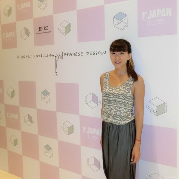
As part of its “Cool Japan” drive to boost Japan’s cultural influence globally, JETRO is working with the DesignSingapore Council to hold a design exhibition, titled Hidden – Unveiling Japanese Design, in Singapore from 4 to 23 October 2014. Free Admission.
More than 120 products will be featured– from glassware, tableware and furniture, to stationery, bags and even packing boxes. Each exhibit will be an object of inspiration to fuel the creativity of budding designers, and show consumers how smart designs shape daily experiences.
Seen at the exhibition:
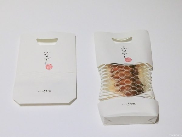
“Funasushi / Sushi Package”: Paper packaging with grid-cut design to flash images of content.
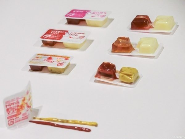
“Dispen Pak”: A container of condiments n one-serving portion, with a thin folding line and tabs on the top cover. Just fold long the line into two, with one hand, and the condiments come out – without the need to remove the cover and dirtying your fingers. Brilliant!
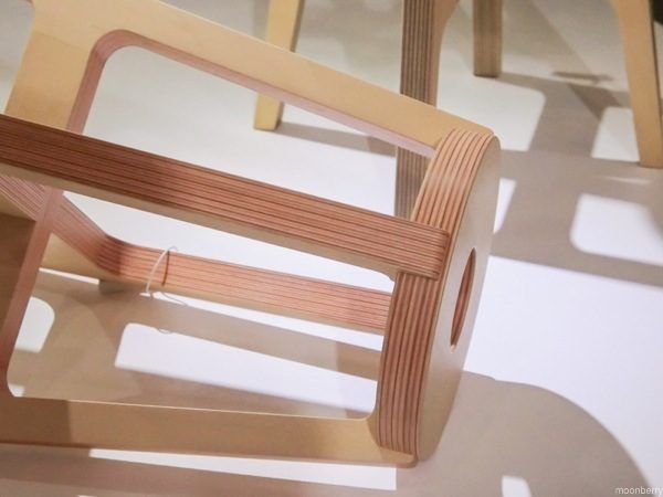
“Paper-Wood Stool”: Thin plywood and colored paper adhered together forming lovely stripes.
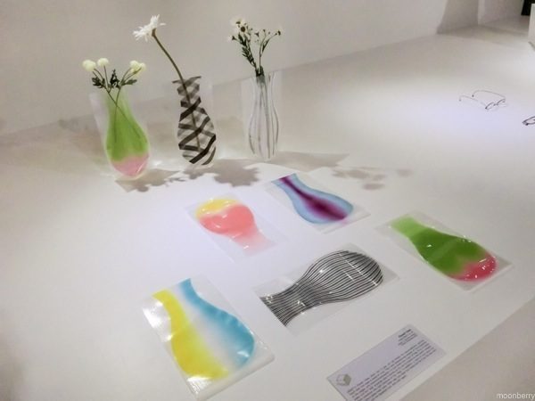
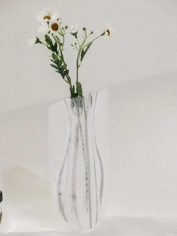
“Flower Vase”: A 2D object turns into 3D – the vase, with water poured in it, becomes 3D and stands on its own.
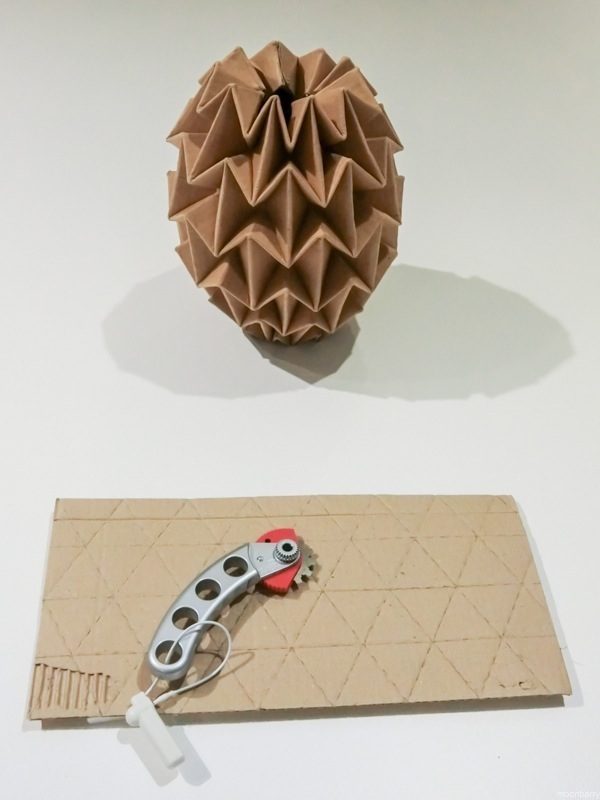
“Or-ita/Cutter Blade”: This tool is not for cutting cutboard but to create perforations so that you can bend and fold it neatly.
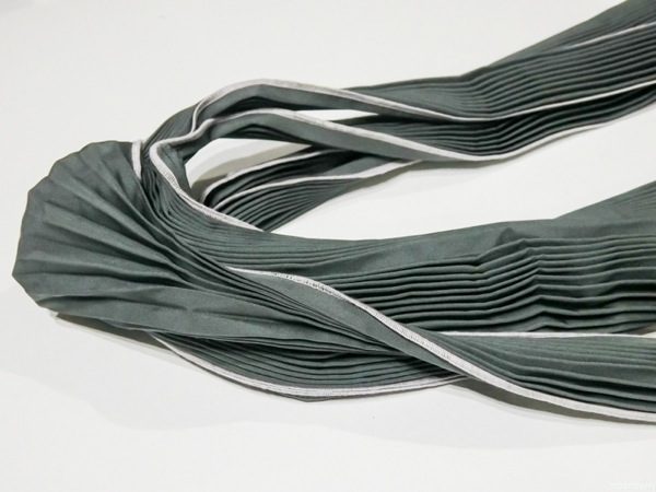
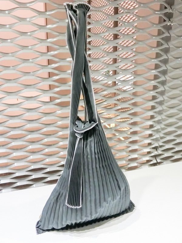
“Vertical-Pleats Bag”: Japan has many things made to the concept of “flexibly changing shapes, from two dimensional to three dimensional” and this fabric shopping bag is one of the examples; from a very slim form, the vertical pleats stretch when the bag contains an object.
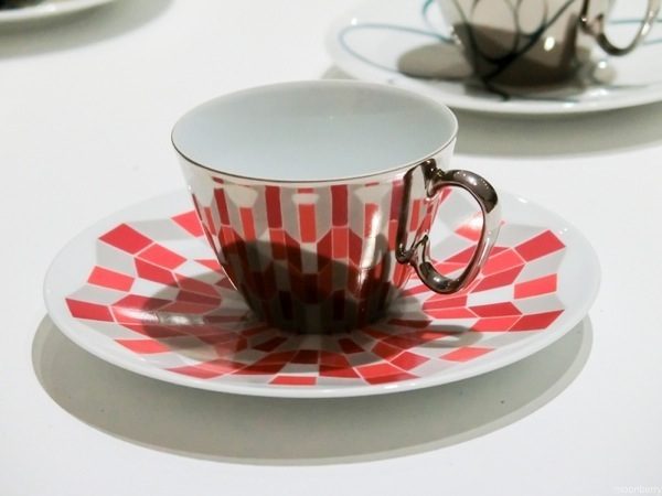
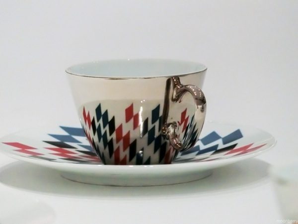
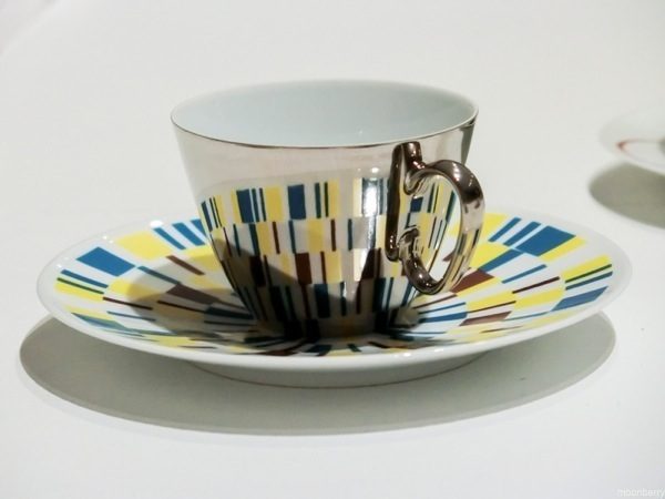
“Cup & Saucer”: From the base to the side, from the flat surface to the curved, a pattern appears. These cups and saucers make use of a visual trick known as anamorphosis. A deformed image, when reflected on a cylindrical mirror, turns into a “normal” image.
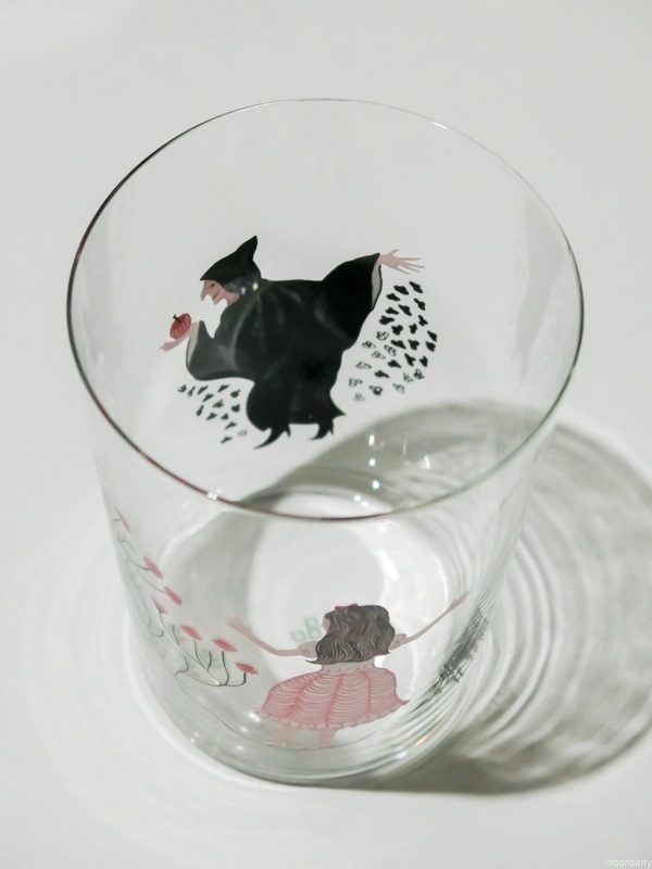
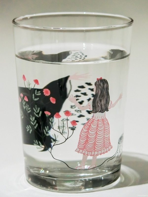
“Glass”: Magnified by water functioning as a lens, a fairy tale world spreads out inside the cup.
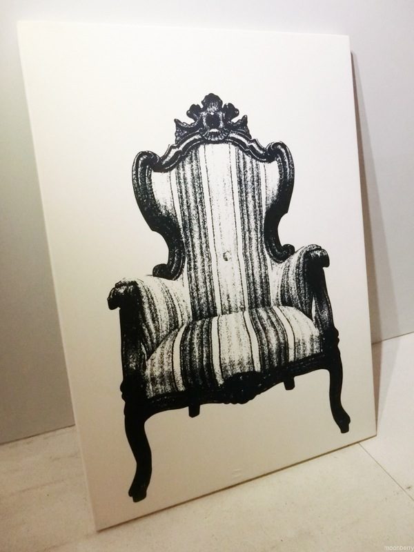
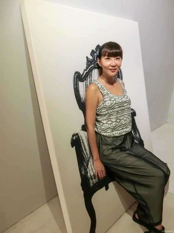
“Chair”: A painting printed on highly-stretchable cloth that transforms a 2D object into a real 3D chair as you can sit on (into?) the painting! Very, very cool.
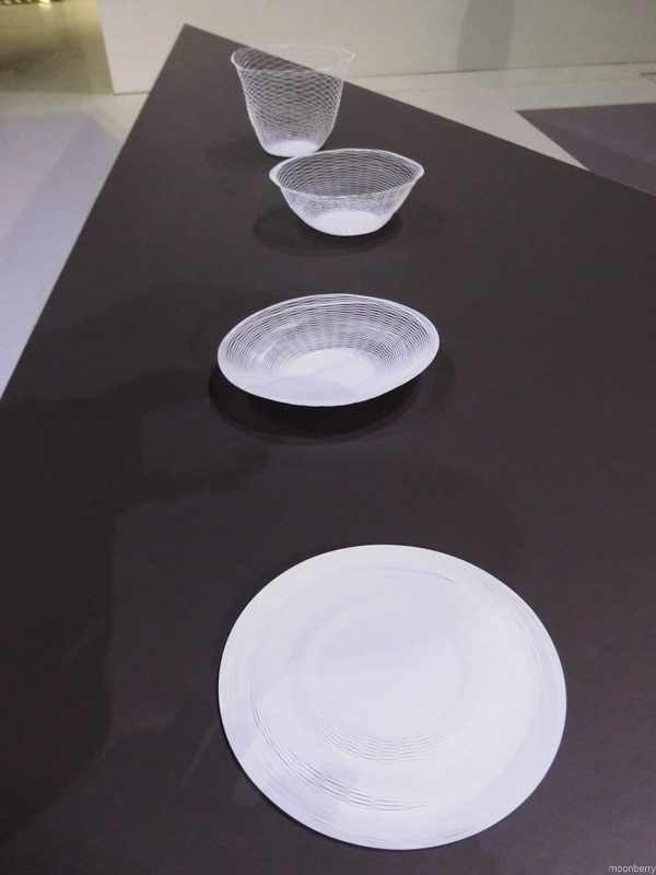
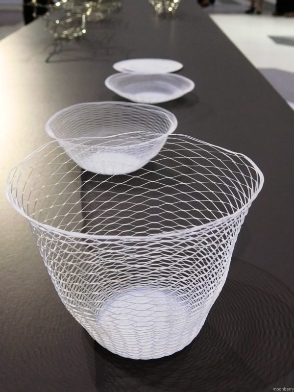
“Kuki no Utsuwa/Air Vase”: A flat perforated paper stretched on each side to freely change its shape and envelops air – to become a container or bowl. The thin and lightweight paper gives strength and resistance to the bowl and allows it to be folded compactly when not in use.
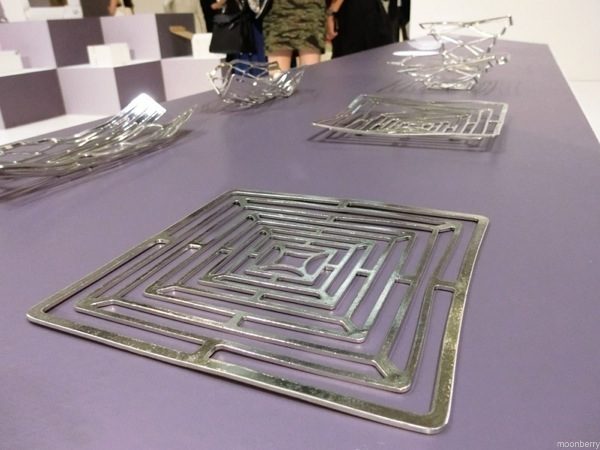
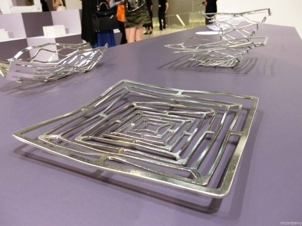
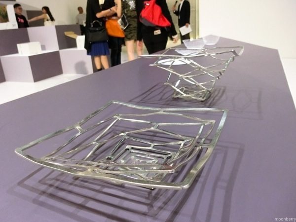
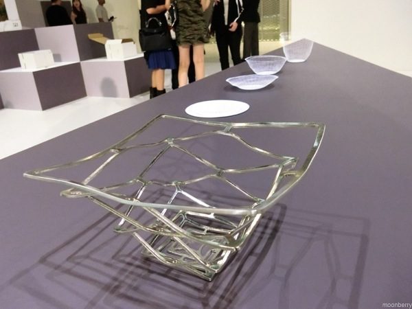
“Kago Square Basket”: At the first glance, it is hard to believe that it is a basket as it looks just like a simple metal plate. This is a flexible basket made of tin which can be bent to fit the shape of any object put in it, and of course, flattened again.
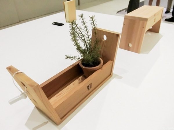
“Carry Stool”: Upside up, it’s a stool. Upside down, it’s a tray!
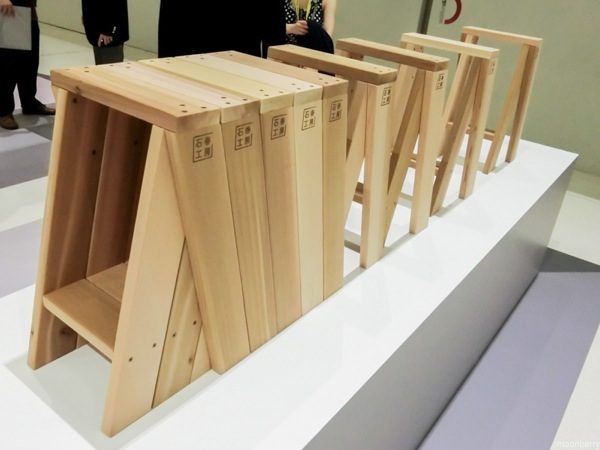
“AA Stool”: Stackable to form a bench.
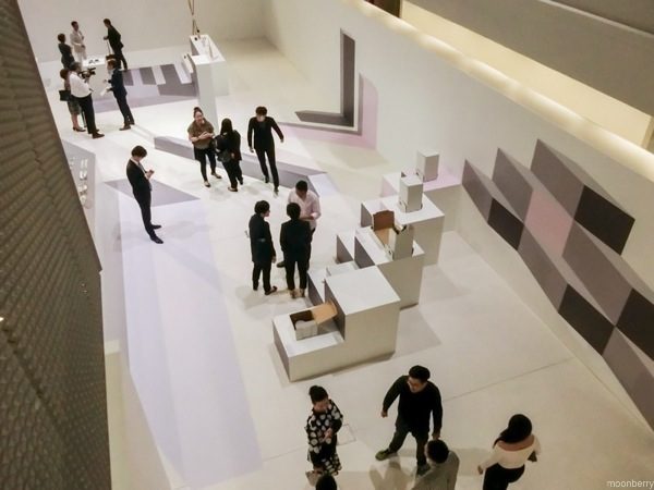
The exhibition is curated by acclaimed Japanese designer Oki Sato, founder of celebrated design studio Nendo. Some of the items are on sale at Tokyu Hands, a Japanese lifestyle store that recently opened its first Singapore branch at Westgate mall in Jurong East.
Dates: 4 – 23 October, 2014
Venue: National Design Centre
111 Middle Road, Singapore 188969
Exhibition hours:11am to 8pm, daily
Admission: Free

